The fastest way to track your fitness journey. No ads. No subscriptions. Just results.
Staying on top of workout progress can be challenging, especially for those looking to refine their strength training. Repwise is a mobile app that helps users track their reps, sets, and weights with ease. The app offers routine personalization and progression tracking, helping users stay consistent and achieve their fitness goals.
My Role
UI Designer
App Preview Designer
Timeline
Fall 2024
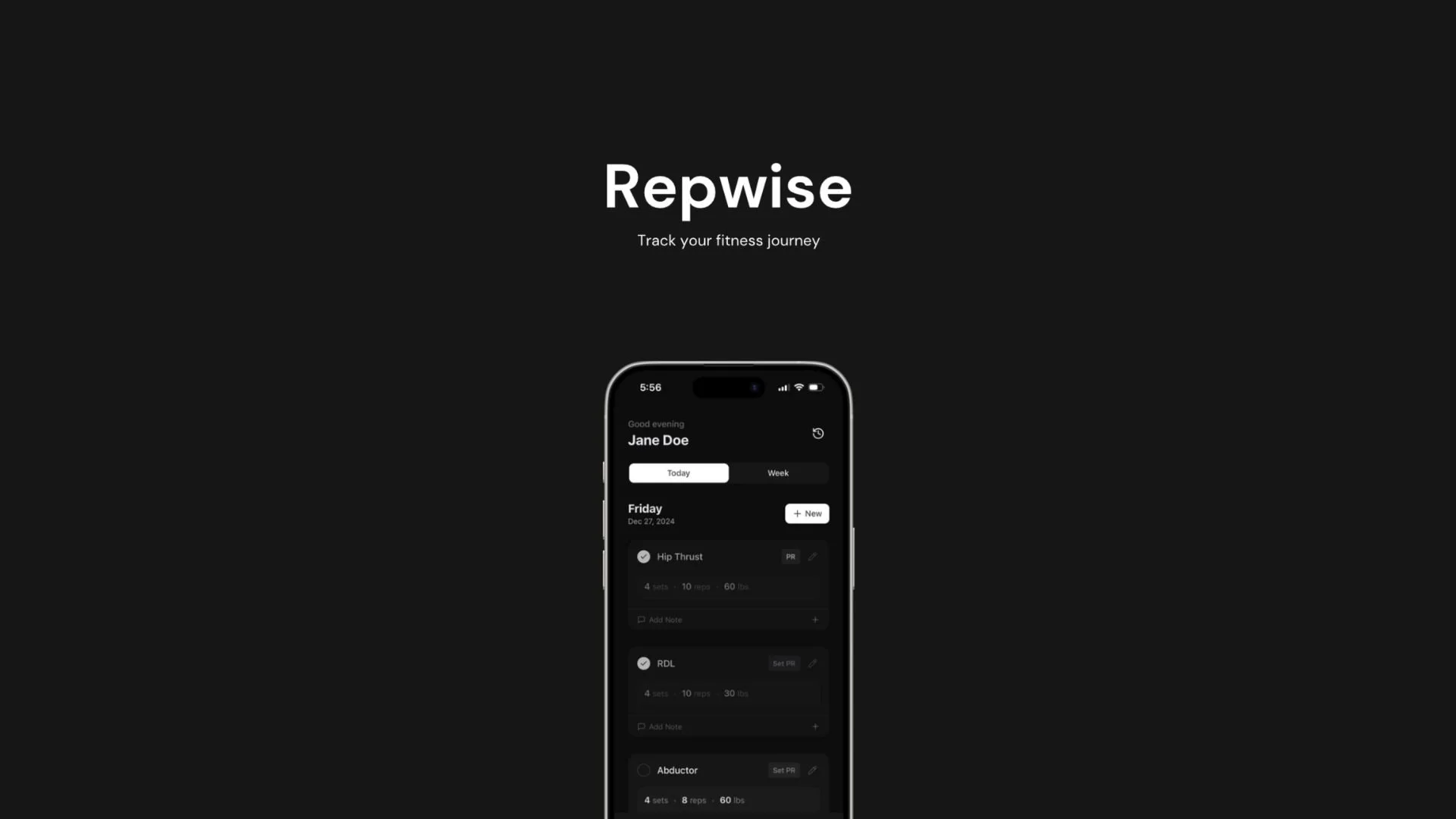
App Previews
01 The Challenge
Existing fitness tracking apps presented a frustrating paradox: they were simultaneously too complicated to use while lacking the depth serious lifters needed. My partner in this project, a developer and avid gym-goer, couldn't find an app that allowed him to:
Track different weights for different sets within the same workout
View detailed workout history over time to monitor progress
Log workouts quickly without unnecessary complexity
After trying multiple apps on the market and finding them all lacking, he decided to build Repwise: a no-frills app designed for lifters who want granular tracking without the bloat of ads, social features, or subscriptions.
02 The Solution
A mobile app focused on three core principles:
Detail where it matters: Support for varied weights across sets and comprehensive workout history
Speed and simplicity: Minimal interface that doesn't get in the way of your workout
No distractions: No ads, no subscriptions, no social features: just tracking
03 Designing for the App Store
With the app functionality built, my focus was creating App Store previews that would communicate Repwise's value proposition to our target users: lifters frustrated with existing apps.
The initial designs (below), while a solid starting point, were refined upon review to address the following issues:
The pop of color inadvertently drew too much attention to the third image, which was considered the least important to highlight.
The subtitle text was too small and caused overcrowding around the images.
The design strayed from the brand’s minimal aesthetic, which needed to be better aligned.
Most of the phone images were centered, making it feel inconsistent for the titles to be misaligned.
These considerations were incorporated into the second draft of the app previews to create a more cohesive and visually balanced design.
04 Redesign
In this round of designs, the issues identified in the initial review have been addressed to create a more cohesive and visually balanced experience. The updates focus on aligning with the brand’s aesthetic, improving readability, and ensuring a consistent layout throughout.
05 Additional Materials
Additionally, I created an app preview video using Canva, incorporating animated elements to showcase the design in action. The final video was adapted specifically for iPhone dimensions, ensuring the app's features and interface were effectively demonstrated for this format.